
Big Living in a Small Japanese Inspired Apartment
This small Japanese apartment building unit shouldn’t be neglected due to it’s size. The goal of this project was to introduce custom designed elements in unique dimensions to elevate this space. Zebra wood, cypress, and bamboo helped bridge the gap between contemporary and Japanese stylings. With a half-queen bed, a full-sized bathroom, and functional kitchen, this micro apartment punches above its weight class.


S P A C E S isn’t just made for small spaces, but they tend to be more manageable projects to tackle since I can fully design the space with both form and function in mind. The larger the build, the more difficult to design. The smaller the space, the easier. Or so it would seem.
I stumbled on another video about an 8 square metre (82sqft) Japanese apartment and I wondered if I could elevate the space given my usual impractical parameters of unlimited budget and copious amounts of custom engineering. For this project, I assumed the rough dimensions as the space (it’s hard to perfectly get and I’m not a magician) and went to work trying to infuse Japanese inspired elements to the space, keeping in mind the simplicity that dominates their design mantra.
This is the result.
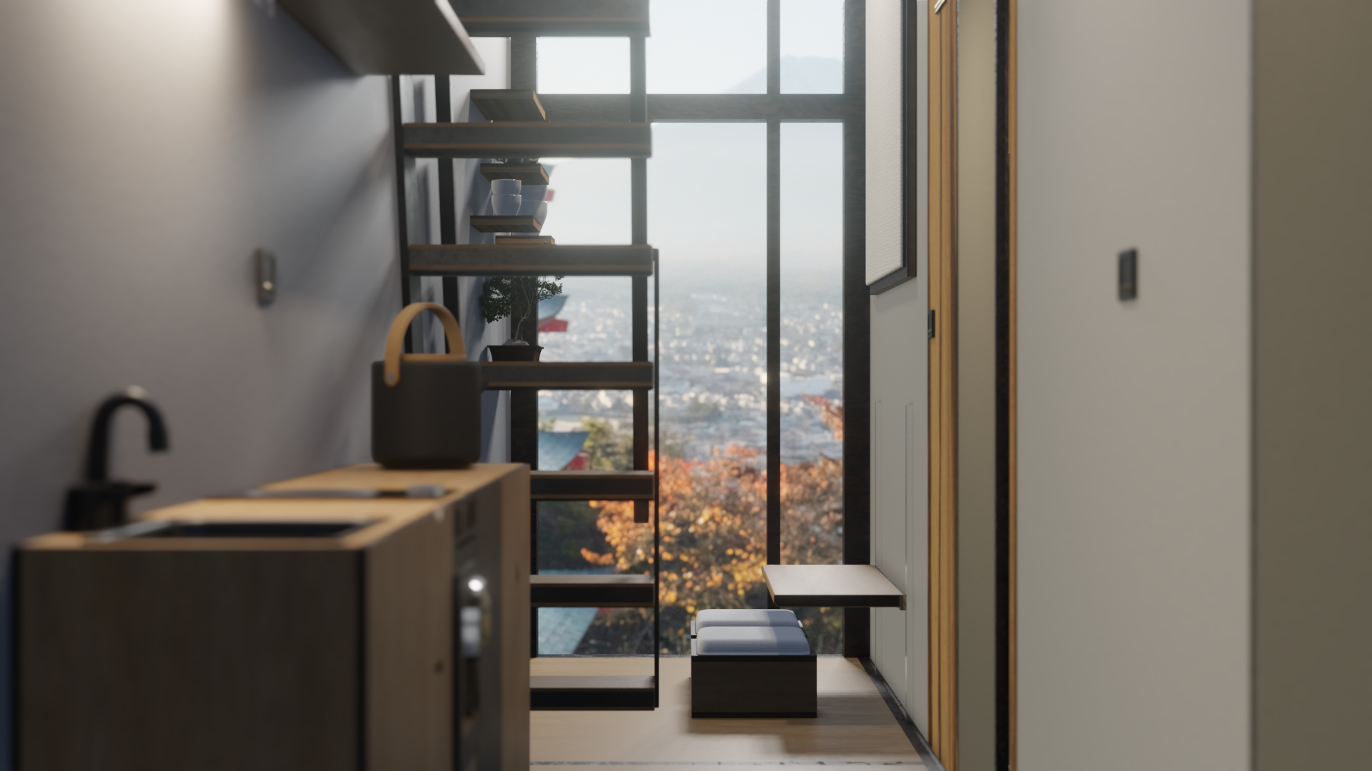
The dimensions of the apartment are about 5.5m by 1.5m, with a second level 9 feet off the ground, accessible by a steep staircase (basically a ladder), measuring roughly 2m by 3.5m, but only 110cm high (thought it’s probably smaller in the source space). One of the key elements of successfully designing a small space is maximizing storage. Using a simple, handle-less cabinetry system, flat surfaces and right angles, and using open shelves where possible, I got plenty of storage space and maintained the minimalistic Japanese interior look.

The foyer area is a foyer, kitchen, and closet, all in one space. The closet position and size I took from the source inspiration and lined it with a dark treated walnut wood (I think as I don’t have the actual texture name. Any wood experts please correct me). Contrasting, I used Japanese Cypress throughout the kitchen cabinetry and floors of the space as the primary wood.
A big part of this entire loft apartment is the kitchen. I noticed in the original design, the kitchen is pretty much non-existent. While not everything can be fit in this place, all of the essentials could be implemented with room to spare.
The kitchen features scaled down features: a single induction stovetop, a small sink, a 0.6 cubic foot convection oven/microwave combo similar to a model by Cuisinart, and a 4.4 cubic foot Magic Chef fridge. A large Stelton Theo teapot set makes an appearance, aiding in the modern Japanese aesthetic. I’m also lazy and I had this teapot from my last project. The counter is made of a coated Cypress and all the metal features are cast-iron.
In the center of the foyer as well as underneath the cabinet is a custom bar lamp, wrapped in a translucent Seigaiha patterned paper. This light makes many appearances in the house but serves as second fiddle to the main pendant light in the living area.
On the opposite side of the kitchen, there is a closet measuring about 0.5m by 0.45m. It’s easily accessed by a sliding door made of paper and wood, meant to allocate space rather than be completely separated from the rest of the unit. The closet has a shrunk down bar lamp lighting the space from the top with a large section in the middle for coats and hanging clothes. A drawer is in the bottom section of the closet, with enough space in it for various knick-knacks, clothes, or for those old hats that you swear you’ll use one day. The weather just isn’t right today! There’s space at the very bottom of the closet for a selection of footwear as well as room at the top for more clothes.

The bathroom is quite small, just about 1sqm in total space, so it was necessary to make some concessions. The narrow sink is Cypress and metal with bamboo lining. A dark walnut soap tray and accessory tray help make use of the vanity space. Inside the sink hanging on the left side is a toothbrush and razor holder, segmented for other supplies. There’s a medicine cabinet behind the mirror for additional supplies.
The bathroom door is the same as the closet: paper and wood frame with brass coloured steel rails to slide. There’s no lock on the actual door as there really wouldn’t be much of a reason for one. It’s a 82sqft space. If you really need one, add a padlock.
Zebra wood is a really funky looking wood that has both the light tones and dark tones of our primary and accent woods. So I used it to cut the whole unit in half, creating a dynamic zone. When in the darker kitchen, it acts like it’s part of the kitchen. When in the lighter living room, it acts like it’s part of the living room. It’s two large cuts of wood extending from the bathroom to the upper level.
On the shower curtain, an abstract Nami inspired pattern repeats on the green shower curtain, maintaining the symbolism so prevalent in Japanese designs and the earthy tones in the unit palette. The shower is tiled on the sides and floor, with a slatted wood panel on the floor, like in my last design. The wall with the shower head is magnetic and the showerhead holder has a magnetic base, allowing the free head to be raised and lowered and positioned to the users liking. It’s also bamboo and gunmetal metal so it looks cool. If you don’t think it looks cool, I don’t think you’re cool.
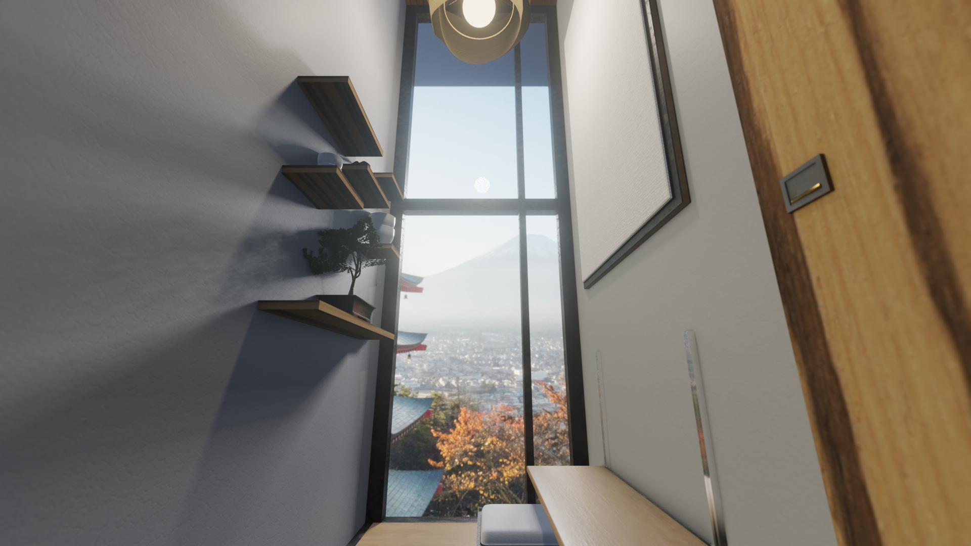
The living space is almost double height. There’s a large set of windows in this mockup, though the source had a balcony. On the main wall, there’s a large canvas frame to absorb sound as well as place-hold for artwork and a custom height adjustable desk with custom seats. On the back wall, a shelf is mounted for decor, objects, as well as a bonsai tree. I once bought one for my mom but it died in eight days, before I could give it to her. Poor Ricardo. It lasted 44 years before it met me. I realize now that they need light, so this one is by the window.
In Japan, sitting on the floor is prevalent. For the living space, I wanted to include this as well as a seamless transition to a western position, something that I’m more used to. To do this, I designed a Cypress desk that lowers to practically one foot about the ground or all the way up into a standing position via two electronic motors housed in a wooded panel. The surface folds up and away to create more space.
Another custom element are the seats, made with the same Cypress + walnut combo throughout the unit. Each seat is about 20cm high, in a 40cm square wooden case. The upholstering on the top is a removable pad to use when sitting directly on the floor. The bottom of the box seat has a cutaway to allow them to be stacked for storage or to make the seats full height, a classic western position, with the cushion on. Each seat also has a medium sized drawer for additional storage and an elastic canvas drawer cover, which can press down on the contents of the drawer so they don’t rattle around when the seats are moved.
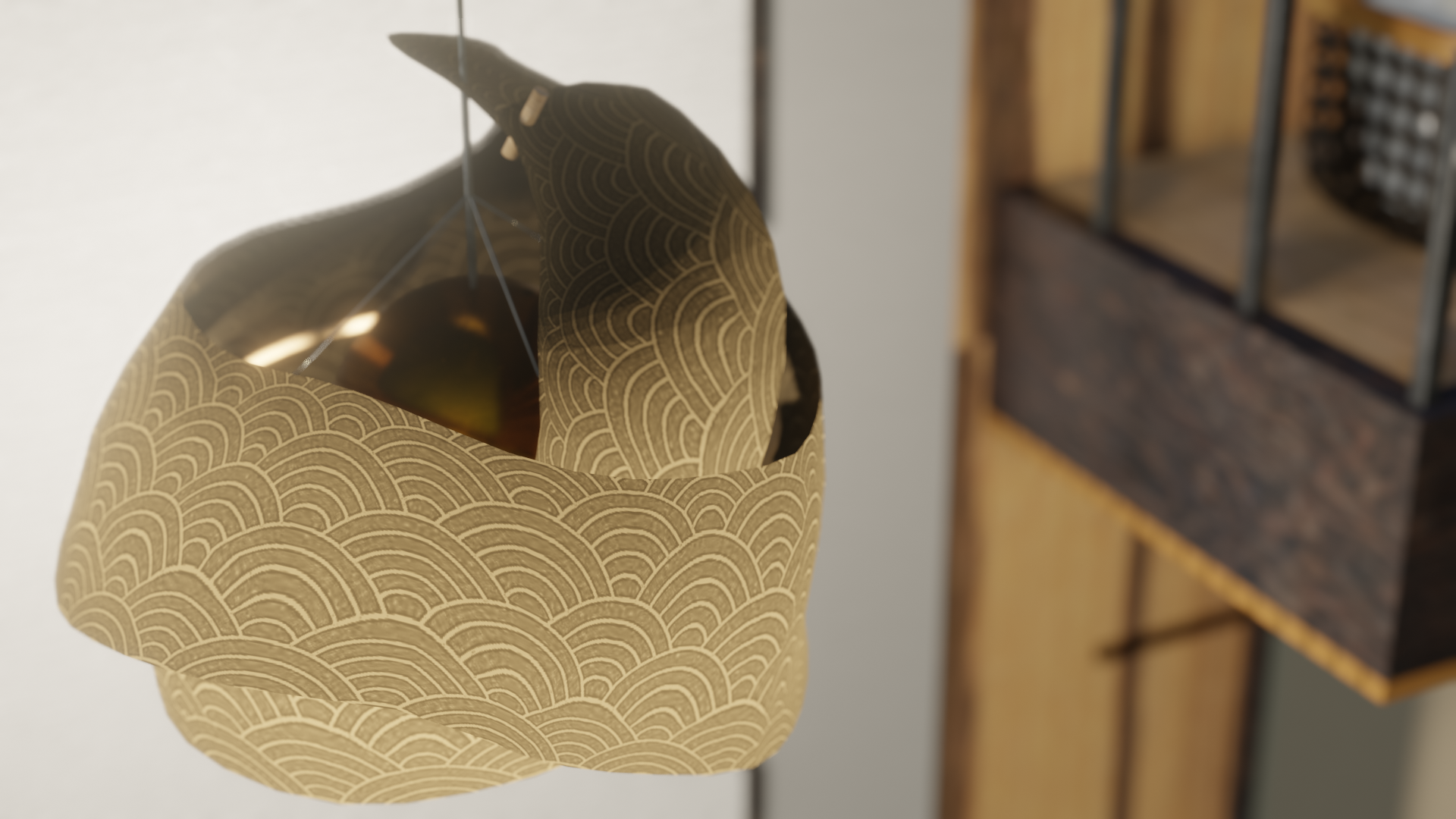
The main pendant light in the centre of the multi-use living space is a custom designed paper lamp, made with Kyo Karakami paper with a Seigaiha pattern. It’s powered by five E26 bulbs omni-directionally inside a diffuse white glass fixture encased in a gold half-sphere and suspended via wire. Japanese Umbrella Pine pins hold the paper together.
Moving upstairs takes some effort. The stair-ladder (I'll call hereinafter a “stadder” because I’m not sure what they are and typing both is a hassle) is made of Cypress, walnut, and iron. Built directly into the wall on one side, they look like they are floating from the inside.

The upstairs level is tall enough to sit and maybe go on your knees if you’re under 5’10”. It’s small but I wanted to respect the initial design parameters. The back wall is a traditional paper-wood wall with light behind it to create some atmosphere. Flat on the floor is a low-slung bed on a bamboo frame. It’s pressed against a Seigaiha patterned black-gold wall. While a lot of the loft section is busy with patterns, they share a similar palette and intent, which is to warm up the space as well as increase the visual size of it.
There’s a four level shelf on the foot of the bed for clothes of tech that needs to be an arms length away. A wood siding-like parquet, identical to the ceiling in the foyer, covers the room. In the centre is another paper bar light. On the wall opposite the bed is a small 32in TV.

In this design, the upper level actually extends into the living area a tiny bit more. It’s only about 60cm wide, but it allows for additional storage for laundry baskets, luggage, or larger items to be put away. The Zebra wood paneling travels up here to create another visually distinctive zone.